Art Through Time: A Global View
Writing
Sylvia Wolf: The idea of what constitutes meaning, I think, is crucial in this discussion of art and the written word. If we look back at hieroglyphs or we look back at illuminated and illustrated manuscripts, they are utilizing language and words, but to provide information. And yet, that a scribe could beautifully and artfully lend some skills with painting to the work is something that we find so satisfying today.
Steve Heller: Paul Rand, the designer who created the ABC logo, the UPS logo, IBM, etc., he wrote a book called From Lascaux to Brooklyn. And it was, essentially, an homage to his own work, but his own work derives from many sources. And the Lascaux caves were, indeed, our first written language. So the word, whether it is in a pictorial form or a letterform, has been part of our artistic understanding since the beginning of man.
John Costello: One of the things that apparently makes our minds different from those of other creatures with intelligence is that as soon as there is a sequence, whether it be sound or visual, the human attempts to put them into a relationship with one another. And so, if you would put three strokes together and then put, lets say, a picture of a fish, it wasn’t three strokes and a fish but three fish. You see? And so the difference between art and writing is that in art the images will stand for something in the real world, in writing they are going to stand for something in language.
Segment Title: Early Writing
John Costello: The four oldest writing systems, the Chinese, the Egyptian, the Sumerian, and the Mayan, were used either for commerce or for what we would call generally religious purposes. The Egyptians believe writing was given to them by a goddess. The Chinese believe that there was this divine dragon that came from heaven and had characters written on its back. The Mayans believe that writing was given to them by twin gods. The Sumerians believe that writing was given to them by several gods.
Marc Van De Mieroop: Around 3400 BC the earliest writing from Mesopotamia comes from this city of Uruk. The cuneiform tablet is impressed with a small piece of reed that has been carved in such a way that you can leave an impression on the soft clay. Each of the signs is made up of multiple impressions of this stylus that together form a sign and the sequence of the signs make up the words and the sentences.
I personally believe that this is an incredibly important moment in the history of humanity because we have a written world out there that is recorded in a very esoteric way for the future to consult.
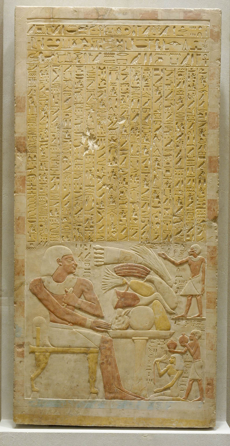
John Costello: Hieroglyphics mystified people, almost through Western history. Hieroglyphics ceased to be written in the early centuries of our era. When Napoleon’s army was fighting in Egypt, they came across a stone inscription in a place called Rosetta. This was written in Greek, and in two forms of Egyptian—the hieroglyphic and the hieratic. And that basically was the key. One of the ways the Egyptians figured to represent something was by parts. Let’s say we have a word in English like “budget.” You can’t draw a picture of the word budget. But if you put a bud and, let us say, a jet, a picture of a jet, together, you could read it as budget.
The Mayans had a writing system before the Spaniards ever arrived and the thing is, fortunately, three manuscripts were preserved. It’s not just writing, there are pictures throughout. And they are absolutely fascinating. There is a reciprocal relationship between what is written and what is drawn. Fortunately, some of the missionaries wrote a great deal about what their beliefs were and that makes the pictures much more meaningful and sheds light on the writing itself.
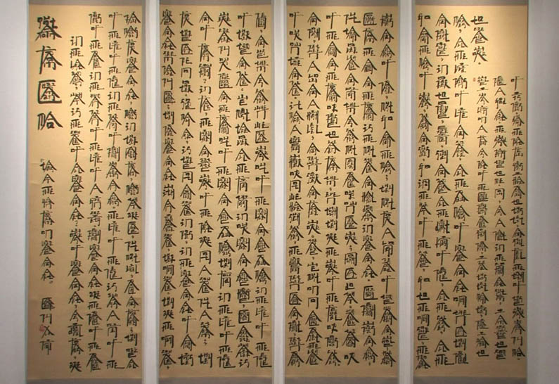
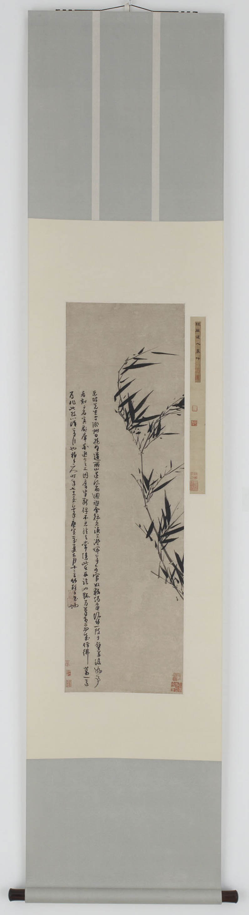
Clearly, you know, within the Chinese culture, everything that had to do with early writing could easily be associated with art. Their characters came from pictures. To this day literate Chinese people can show you a Chinese character and show you the picture that it comes from. If you have hundreds, if you have thousands of characters, how can you possibly come up with an order? Count the number of strokes. The primary way that their dictionary is set up is all the characters that consist of one stroke go in one section, next section two, and so on. The Chinese were the first entomologists, long before Western entomology came along. And not only that, but they were graphic entomologists.
Segment Title: Illuminated Manuscripts
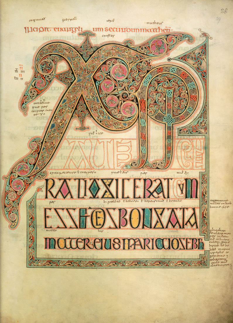
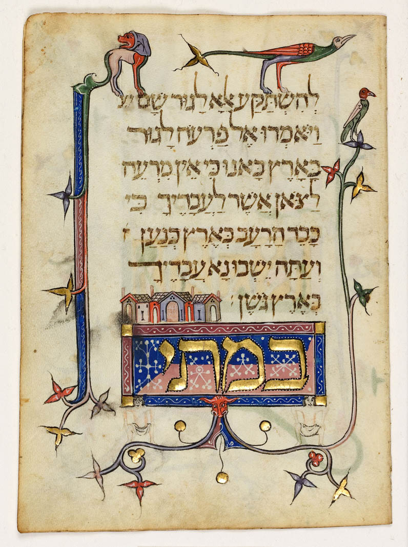
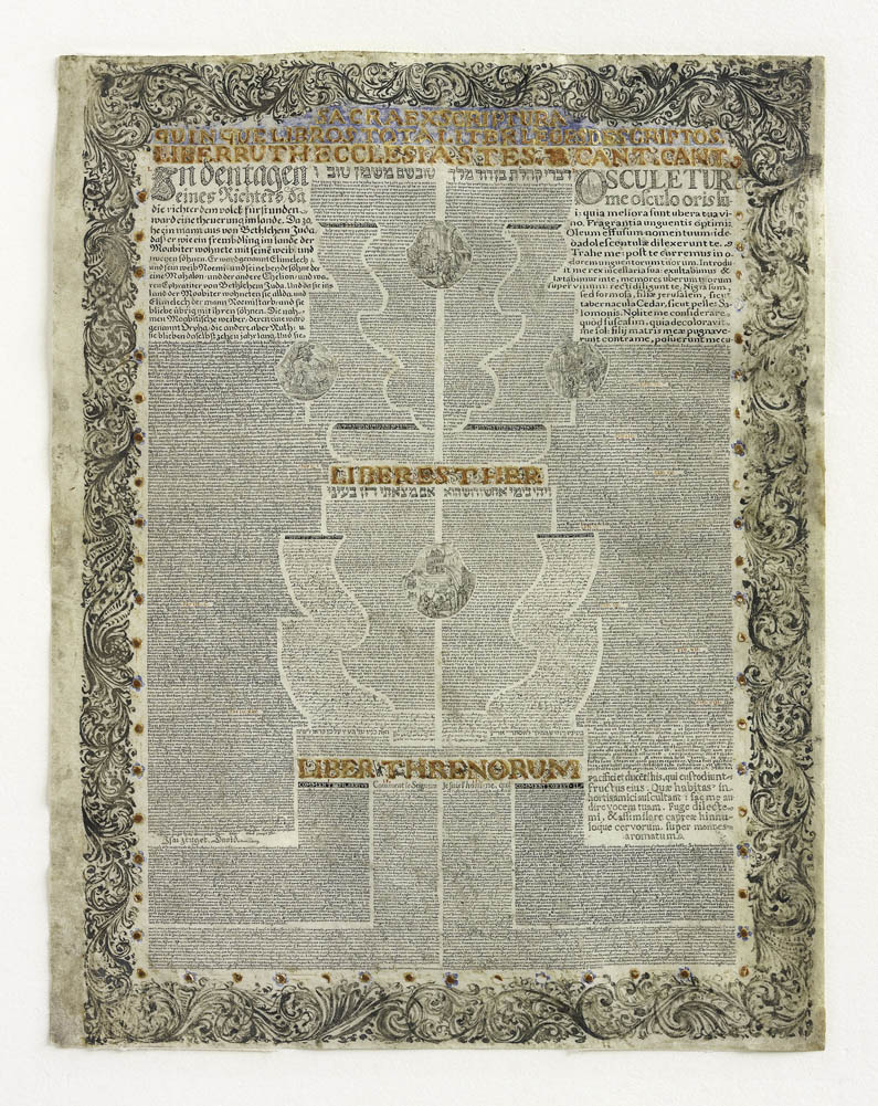
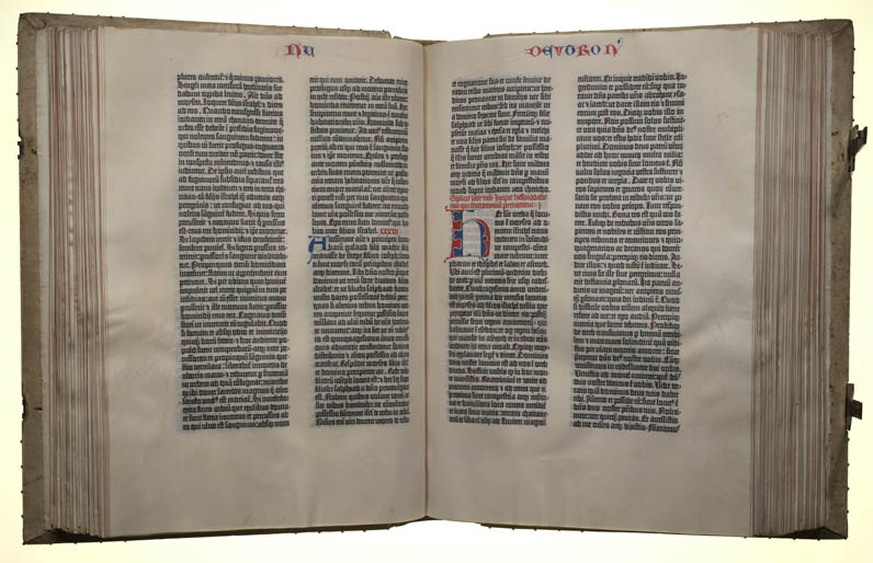
Sharon Liberman Mintz: Every manuscript is an artistic endeavor. It’s an adventure between the scribe, the source that he is copying from, the paper and the parchment, and the moment. So he sits down, he gets his materials ready, and there is a creation, there is an aspect of creation, which is very exciting. The art of Hebrew illuminated manuscripts really begins in the ninth and the tenth centuries of the Common Era. It is at that point where we begin to see beautifully decorated books and manuscripts being produced and they are sumptuously illustrated Bibles replete with all kinds of decorated techniques, gold, scribal lettering that enhances the text. They are very, very visual beautiful objects. Jews were not allowed into the guilds during the medieval period and a lot of the knowledge of how to decorate manuscripts, how to create these beautiful embellishments, how to grind pigment, how to make sure that the gold leaf is applied properly and will stay, was closely guarded trade secrets, and if you weren’t part of the guild, you weren’t going to be able to figure this out. So we believe, and we know in certain cases, that some of the very beautiful illuminated manuscripts of the later medieval period were probably done by Christian workshops. But there are several examples in this manuscript where the scribe appears to have decorated the word panels himself. This is scribal art, as opposed to the more elaborate gold and gouache that we saw on the opposite pages and this charming ink work is very typical of fifteenth century scribal decoration. Scribes in the medieval period often left small indicators of themselves within the manuscript, as a measure of how proud they were of the handiwork. Here we see that the scribe has added a beautiful little flourish and wanted you to realize that he was responsible for the creation. The Jews actually called their bibles Mikdash Yah, a small sanctuary, a portable sanctuary. They could take these beautiful, portable, little objects from place to place and think of them as an entrance in service to the worship of God.
David Roxburgh: There are so many aspects of the written tradition that are rule-bound and convention- bound, and yet there is a place within that structure for an artist to find an individual expression. The teasing out that notions of authorship, what it means to be an author, an individual calligrapher within a tradition where there are rules that prescribe how you form letters, what kinds of proportional relationships should be made between letters, what the conventions are for joining letters or spacing letters on a page. We certainly do call it art, and it was considered to be art, but what is artful about it is another, something a little bit more challenging. The perception of Islamic art is that calligraphy has always played a fundamental role in it because of the value of the Muslim scripture, because of the value of the Qur’an as a text that was revealed to the Prophet Muhammad through the angel Gabriel by God. And so that understanding has always led people to believe that writing was already an art form from the very, very beginning.
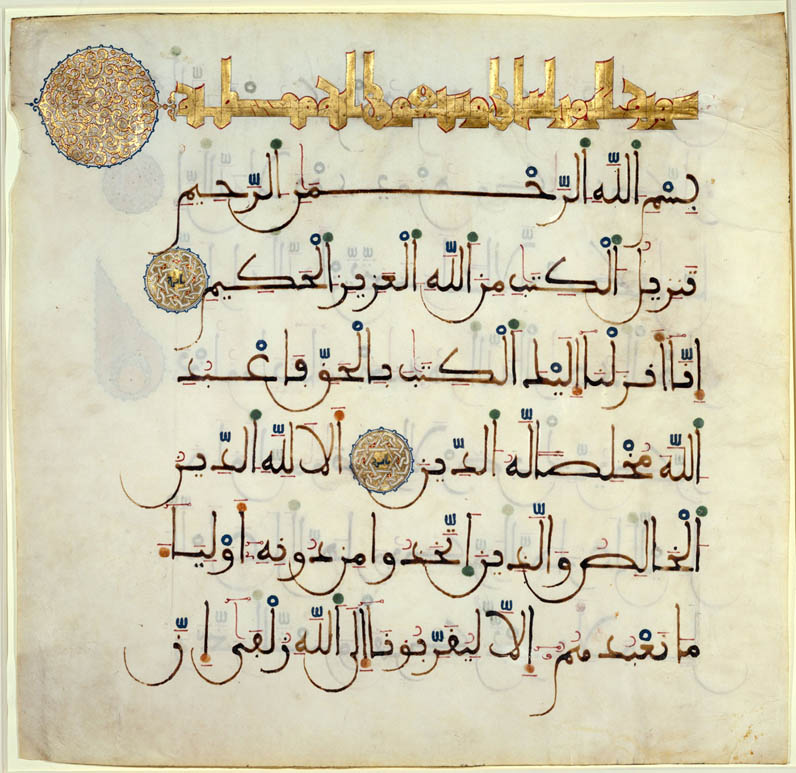
Adriana Posner: This is eighth-century Kufic script. It’s on, written on parchment, not on paper. This was before the beginning of the use of paper in the Islamic world. And what’s so incredible to me about this script are these long stokes of the pen that are just incredible. It’s very, very difficult to read. And, in fact, if you haven’t memorized the Qur’an, it’s almost impossible to read this, because there are no what are called diacritical marks. There is nothing in it to tell you where a sentence stops and starts, nothing to tell you where the stress goes in the word. But, but visually it’s incredibly bold and beautiful. This is the one of the earliest pieces that comes from a Qur’an in the world. It’s datable to mid-seventh century. So it may even have been written towards the end of the life of the Prophet Muhammad, maybe just a little bit after his death, so it’s just extraordinary. This is a script that is known as hijazi script. And you can see it’s a little bit more rounded, but, again there’s no punctuation, there are no diacritical marks, so it just flows and flows and flows and flows. This is what’s known as a bi-folio, two pages from a Qur’an, also a famous Qur’an known as the Nurses Qur’an. And it’s eleventh century. Here you just have fragments. This is from North Africa. Now you can see actually that the calligrapher has also put in these markings, these red, sort of comma-looking things, and dashes. So what we are seeing here is a kind of development of script types.
David Roxburgh: There is a historical consciousness, there is an aesthetic consciousness develops and is elaborated around the act of writing, the culture of writing, the value of writing, what writing will give you.
Adriana Posner: In the Islamic world calligraphy is considered the highest form of art. And this is interesting because in East Asia, in China and Japan and Korea, calligraphy is also considered the highest art form. There is a distinction, though, because in the Islamic world calligraphy has that very close tie with the word of God. It’s just so sacred in this part of the world and the embellishment that becomes associated with it is really very special and quite spectacular.
Segment Title: Chinese Calligraphy Transformed
David Cateforis: Xu Bing is one of the major contemporary Chinese artists of his generation. He was one born in 1955 and grew up in Beijing. Books, literature, language, calligraphy, writing are all central to his work as an artist.
Xu Bing: (Chinese)
Jesse Coffino Greenberg (translating): The sort of relationship that the people of my generation had with culture, with the written word, and with literature was really an awkward relationship.
Xu Bing: Dealing with the Cultural Revolution, we can’t read. Everybody only read The Little Red Book. So after the Cultural Revolution I can read lots of books. Yeah, but when you read too much you feel really uncomfortable, like someone has a chance to overeat before you are really hungry.
Jesse Coffino Greenberg: The idea of Book From the Sky sort of came forth at that time.
Xu Bing: That work I started from 1987, and I finished by 1991. About four years. But when the people come into the space, they try reading the book. but no one can read it. They really, look really like real Chinese. But I created each letter, over four thousand nonsense characters. My idea is that I want to take away any meaning, even the style of the letter. But this letter is kind of funny, some Japanese people think, “Oh, that is Korean.” Some Korean people think, “That’s Japanese.” Some Chinese people, they think they are real Chinese that are used from the earlier time. But actually, no one can read it, not even myself. Look at that—beautiful. Each one I carved myself.
David Cateforis: So Xu Bing leaves China in 1990 he is invited to be an honorary fellow at the University of Wisconsin, Madison. Now he has to confront a totally new language.
Xu Bing: In the beginning I am really, really bad in studying English. I am really slow. So just working, I started back in 1993 because I live in between of the two cultures. “In the beginning, is the end.”
David Cateforis: The innovation that Xu Bing comes up with is what he calls “square-word calligraphy.” And here what he is doing is using traditional Chinese calligraphic strokes that are used to write script to write English. So from across the room this looks like a set of traditional hanging scrolls written in Chinese. Traditionally Chinese was written vertically in columns and it was read from right to left, top to bottom. The Chinese reader, getting closer, will discover that these are not actually Chinese characters. You can’t read this if you only read Chinese. If you read English and you get closer, you may start to discover combinations of strokes that look like English letters, and indeed they are. This is an example of what Xu Bing calls square word calligraphy.
Xu Bing: This is copy book, here, this is a red line tracing book. Looks like when I was little when my father lets me do one page, copy of masterpiece. This is a really traditional way of treating the calligraphy. So, you can see this, you can see this, this is a little: L-I-T-T-L-E. This is B-O. P-E-E-P. Little Bo Peep, Little Bo Peep has lost her sheep. And I want to use a children’s song to look like it’s an introduction class.
Jesse Coffino Greenberg: So you can see what is detailed here is the stroke order for the English word king, which follows the same pattern for constructing a character with the first stroke and the second stroke and the third stroke, fourth, fifth, sixth, seventh, eighth, ninth, tenth, eleventh, and then finally the twelfth stoke. See how it goes from the outside, top to bottom, outside, inside, top to bottom, closing, and then interior.
David Cateforis: So it is not only a way of writing, but when we look at it, we are encouraged into a new way of seeing. Seeing our own language written differently in ways that make it strange and wonderful and marvelous all over again. Here you can learn to read and write your own language again in a new way that is also introducing you to another cultural tradition.
And it does, then, also make the verbal visual, which is one of the fundamental aspects of Chinese writing.
Xu Bing: E-L-I-O-T. Okay. And good. “In the beginning is the end.” Adapted from T.S. Eliot. Yeah, that’s X B. It’s signed.
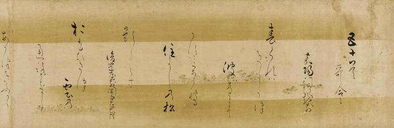
Yoshiaki Shimuzu: You know, to talk about the Japanese calligraphy, we have to sort of understand that first Japanese saw the written characters from, written by the Chinese. They heard how the Chinese are pronouncing it. If a character like an, you know, which means “peace,” they thought this sound, this character an written this way sounds like a Japanese “a.” So they use that character to mean, to pronounce, as a sort of pronouncing, pronunciation symbol. So on one hand, the Japanese adopted the Chinese, some part of the Chinese writing system to suit their need. That is to create the written symbol for their sound. They also violated one of the functions of Chinese characters, that is to convey meaning.
But, but the Japanese are rather quick-tempered, and when they transcribe they cut corners. So that instead of using one, two, three, they go one and three, you know. So there is a, I would say, a cultural eccentricity of how the Japanese simplify it, but once you do that, then you can talk about the artistic side.
Now, why does the Japanese calligraphy look so thin? You know, they are like mosquito thin when you looking at. And the Chinese will not tolerate a very thin tone of ink. They would demand that in writing you must use the darkest ink. Certain architectonic quality is something that canonically is required in Chinese writing. Japanese looks almost anemic except there is a, there is aesthetics of that. Aesthetics of “trembling style,” you know, there is a word for it.
And, also the Chinese calligraphy, if they are transcribing a poem, there are certain order in which the column, columnization and all these things are observed strictly. The Japanese would break this form and they begin to write the character in a scattered way so that even the scattered style becomes a canon of its own.
Segment Title: The Modern Era
Sylvia Wolf: If we are looking at the written word in art, we have to look at both technological innovation and the dispersal of information both pictorial and information as language. And in the twenties and the thirties, when you move through Cubism, Dadaism, Surrealism, and Futurism—all of them heavily dependent upon language and words and the collision of what happens when you put these things together in a fashion that is out of the norm, they no longer become information in the manner in which we are used to.
John Baldessari: I think the wonderful irony about this piece is that it’s text. But in fact it is a painting because it is paint on canvas. So I’m really being very slyly ironic here in saying well this is what painting is.
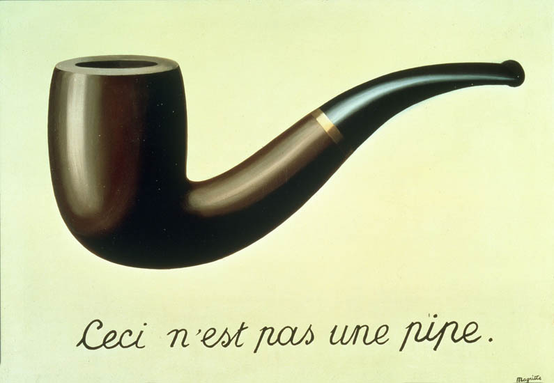
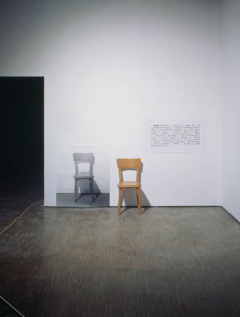
Sylvia Wolf: In the 1960s the artists that were challenging the hierarchy of information and what made visual art, art. And by including words, for example, or everyday objects. And I am thinking about Kosuth, for example, and his piece One and Three Chairs from 1965, where you have an equal weight is given to the object, a chair, to the photographic reproduction of the chair, and to the dictionary description of the chair. Which is the correct chair? Ceci n’est pas une pipe? Is this a chair, is it a pipe?
Lawrence Weiner, who did away with any visual symbolism and used words transcribed directly onto walls so that they take a form as content on the walls, but there is no actual graphic picture. The word becomes the picture. John Baldessari, Ed Ruscha, Sol Lewitt, a number of the Conceptualists who were working in the ’60s and ’70s were asking questions about where does the ideal begin and is the art the idea? If you think about Conceptualism as a form of art that privileges the idea more so than the form, that is a period that is very rich in visual arts that utilize words.
Steve Heller: There are letterforms that will motivate and there are letterforms that will seduce, and there are letterforms that will just act in a nondescript manner, non-confrontational manner. All kinds of letterforms will have kind of effect on the viewer.
John Costello: Writing is the graphic, symbolic representation of language. And so the creativity, the intellectuality of what people have done with language they can do in writing. And everything that had to do with writing could easily be associated with art.
Images and words are symbols that both denote actual things, like people, objects, and places, and connote more abstract ideas, feelings, concepts, and theories. Given this shared function, it makes sense that the boundaries between words and images often overlap and that the two are so frequently juxtaposed. Since the dawn of civilization the relationship between written words and pictures has been manipulated to communicate ideas. It has also inspired countless artists around the globe, whose works demonstrate how text and image can enhance, supplement, complicate, or even undermine each other’s meanings.
All Video on Demand files are protected by copyright law and are free for this streaming purpose only. Downloading, in whole or in part, is strictly prohibited. Offenders will be subject to civil and/or criminal liability under applicable laws.
Compare
Expert Biographies
Xu Bing is a contemporary artist and vice president of the Central Academy of Fine Arts, Beijing, where he earned his B.A. and M.F.A. Bing’s artwork has been featured in solo exhibitions in a number of prominent museums worldwide, including the Arthur M. Sackler Gallery at the Smithsonian Institution, the New Museum of Contemporary Art, and the Joan Miró Foundation in Spain. Bing creates his work in a wide variety of media and received a MacArthur Foundation Award for his special contributions to the fields of printmaking and calligraphy. For his work, Bing has also been awarded with the Fukuoka Asian Culture Prize, the Wales International Visual Art Prize, and a lifetime achievement award from the Southern Graphics Council.
David Cateforis, Ph.D., is a professor specializing in American and modern art at the University of Kansas. His research and publications focus broadly on twentieth century American art and international contemporary art. Courses he has taught at the University of Kansas include the introductory survey of Western art history, Modern Sculpture, and Art since 1945. Cateforis is the author or editor of several books, including Willem de Kooning and Decade of Transformation: American Art of the 1960s. The University of Kansas awarded him the William T. Kemper Fellowship for Teaching Excellence and the Archie and Nancy Dykes Award for Outstanding Classroom Teaching. Cateforis received his B.A. from Swarthmore College and his M.A. and Ph.D. from Stanford University.
Melissa Chiu, Ph.D., is museum director and vice president for global art programs at the Asia Society in New York. An expert on Asian contemporary art, Chiu is responsible for establishing the museum’s contemporary art collection along with curating path-breaking exhibitions. She is a frequent media commentator on arts and culture and has lectured at universities including Yale, Columbia, and Harvard. Prior to joining the Asia Society Museum, Chiu founded the Asia-Australia Arts Centre in Sydney, Australia. Chiu has also authored many articles and books, most recently, Breakout: Chinese Art Outside China. Chiu holds a Ph.D. in Art History and an M.A. in Arts Administration.
Jesse Coffino-Greenberg helps run the Xu Bing Studio in New York and occasionally acts as Xu Bing’s interpreter. He is a graduate of Columbia College in New York, where he majored in political science; he also studied Mandarin and has traveled extensively in China.
John Costello, Ph.D., is a professor of linguistics at New York University. Costello joined the NYU faculty in 1967. He has focused his research on the reconstruction of Proto-Indo-European syntax, the reconstruction of Proto-Indo-European phonology, and linguistic change in Pennsylvania German. Costello has authored many books and articles, including Syntactic Change and Syntactic Reconstruction: A Tagmemic Approach, “German in New York,” and “Modal Auxiliaries in Proto-Indo-European.” He has also served as the editor of WORD, the Journal of the International Linguistic Association. Costello has received a number of grants from NYU’s Arts and Sciences Research Fund and is a member of the American Society of Geolinguistics and the International Linguistic Association. Costello earned his B.A. from Wagner College and his M.A. and Ph.D. from NYU.
Steven Heller is the co-founder and co-chair of the M.F.A Design program and co-founder of the Design Criticism program at the School of Visual Arts (SVA) in New York. After several years working as art director on the New York Times OpEd page, Heller became art director for the New York Times Book Review, a position he held for almost thirty years. He now writes the “Visuals” column for the New York Times Book Review. Heller is the author, co-author, and/or editor of more than 120 books on design and popular culture and has been a contributing editor to Print, Eye, Baseline, and I.D. magazines. He has produced and curated numerous exhibitions, including “Art against War,” “The Satiric Image: Painters as Cartoonists and Caricaturists,” and “The Malik Verlag.” He is also the recipient of the AIGA Medal for Lifetime Achievement. He is the editor of the AIGA VOICE, its online journal, and author of the Daily Heller blog at Printmag.com.
Sharon Liberman Mintz is curator of Jewish art at the Library of the Jewish Theological Seminary in New York and specializes in the art of Hebrew illuminated manuscripts and rare printed books. Over the course of twenty-two years at the Library, Mintz has curated over forty exhibitions and co-authored eleven exhibition catalogues. Since 1994, Mintz has also served as the senior consultant for Judaica and Hebraica at Sotheby’s. In that capacity she has participated in the sales of several outstanding collections of Judaica and Hebraica and most recently assisted with the record-breaking exhibition of the Valmadonna Trust Library. Sharon’s latest publication, A Journey through Jewish Worlds: Highlights from the Braginsky Collection of Hebrew Manuscripts and Printed Books, accompanies an international exhibition that she co-curated.
Adriana Proser is the John H. Foster Curator of Traditional Asian Art at the Asia Society in New York. Proser has curated many exhibitions for the Asia Society, including “Devotion in South India: Chola Bronzes” and “A Passion for Asia: The Rockefeller Family Collects,” which showcased the Rockefeller family’s Asian art collection and coincided with the Asia Society’s fiftieth anniversary. In addition, she co-authored, A Passion for Asia: The Rockefeller Legacy. Proser is currently managing a special project for the Asia Society supported by a grant from the National Endowment for the Humanities, which includes a touring exhibition entitled, “Pilgrimage and Buddhist Art,” and a documentary film biography of the Buddha.
David J. Roxburgh, Ph.D., is the Prince Alwaleed Bin Talal Professor of Islamic Art at Harvard University. Courses he has taught there include Landmarks of World Art and Architecture, Early Islamic Art and Architecture, and Art in the Wake of the Mongol Conquests. Roxburgh has authored many articles, essays, and books, including Traces of the Calligrapher: Islamic Calligraphy in Practice, c. 1600–1900. For The Persian Album, 1400–1600: From Dispersal to Collection, Roxburgh received a Millard Meiss Publications Grant from the College Art Association, the Choice Outstanding Academic Titles Award, and honorable mention for the Saidi Sirjani Book Award. In addition, Roxburgh has been honored with a number of fellowships, including the J. Paul Getty Trust Postdoctoral Fellowship and the Smithsonian Institution Pre-doctoral Fellowship. Roxburgh received a M.A. from the University of Edinburgh and Edinburgh College of Art and an M.A. and Ph.D. from the University of Pennsylvania.
Yoshiaki Shimizu, Ph.D. recently retired from Princeton University, where he was the Frederick Marquand Professor of Art and Archeology, specializing in Japanese and Buddhist art. His many areas of interest include Japanese ink painting of the medieval period, Heian and Kamakura narrative painting, arts of Zen Buddhist establishment, Sino-Japanese cultural history, and Chinese and Japanese calligraphy. Shimizu has published extensive articles, essays, and books, including Masters of Japanese Calligraphy, 8th–19th Century, Japan: The Shaping of Daimyo Culture, 1185-1868, and “Japan in the American Museums: But Which Japan?” Shimizu co-curated the exhibition “Awakenings: Zen Figure Painting in Mediaeval Japan” for New York’s Japan Society and was named the Society’s scholar in residence from 2006–2007. Shimizu holds an M.A. from the University of Kansas and a Ph.D. from Princeton University.
Marc Van De Mieroop, Ph.D., is a professor of ancient Near Eastern history at Columbia University. Van De Mieroop has published over eighty articles and reviews, and has authored several books, including, The Eastern Mediterranean in the Age of Ramesses II and King Hammurabi of Babylon: A Biography. Van De Mieroop received his B.A. from the Katholieke Universiteit and his Ph.D. from Yale University.
Sylvia Wolf is the director of the Henry Art Gallery at the University of Washington, Seattle. She has also been a curator of photography at the Art Institute of Chicago and the Whitney Museum of American Art. In these positions, Wolf has organized over fifty exhibitions and written over twelve books on contemporary art and photography, including Julia Margaret Cameron’s Women; Visions from America: Photographs from the Whitney Museum of American Art, 1940–2001; Michal Rovner: The Space Between; Ed Ruscha and Photography; and Polaroids: Mapplethorpe. Wolf has taught studio, art history, and museum studies courses at the graduate and undergraduate level, most recently at Columbia University, New York University’s Tisch School of the Arts, and the School of Visual Arts, New York. Wolf received a B.A. in French literature from Northwestern University, an M.F.A in photography from Rhode Island School of Design, and is currently writing her dissertation as an international fellow at the Amsterdam School of Cultural Analysis, University of Amsterdam, Netherlands. She has been awarded the Chevalier de l’Ordre des Arts et des Lettres by the French government for her promotion of French culture in the U.S.