Tools of the Simulator
Run Controls
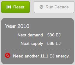
- Reset Button
- Reverts to the beginning year and settings.
- Run Decade
- Simulates the progression of energy supply and demand for ten years.
When there is not enough energy to meet demand, this button is greyed out. A message appears in the status area
saying how much more energy is needed to proceed.
Simulator Parameters
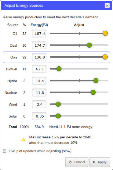
- Add Energy | Adjust Energy Sources
- The label on this button
changes between Add Energy, and Adjust Energy Sources. If Run Decade is greyed out, the label is Add Energy,
as a prompt to click here instead.
- Opens a dialog box (see above) that allows you to alter any or all of the eight energy sources listed.
There are four columns: Source, %, Energy (EJ exajoules) and Adjust. For each source listed, the % column tells you what
percentage of the current energy mix is generated from that source. A message at the bottom of the Adjust column
says how much more energy is required to meet demand.
If a slider knob is yellow, selecting that source row displays a message at the
bottom of the dialog explaining a limitation.
For further information on any of the energy sources, please see Unit 10.
- The slider for each energy source adjusts how much of it to use for the next decade, in exajoules
(1018 joules). The ends of the slider represent the maximum and minimum range of energy change for the decade, although
a type-in value to the left might be permitted to exceed those limits, depending on other settings. You can always type in a value
rather than use the slider. If the slider knob is yellow, you've reached a limit, explained at the bottom of the dialog. The previous
decade's value of this energy source is shown by a grey marker on the slider line. Tapping or mousing over that marker gives a tooltip
of that previous value.
- If this checkbox is checked, the line plots and pie plot are updated while you adjust
energy sources. Performance is very poor on mobile devices, so the default is unchecked.
- This button accepts the new energy mix you've created.
- This button brings you back to the main simulator screen without altering the energy mix.
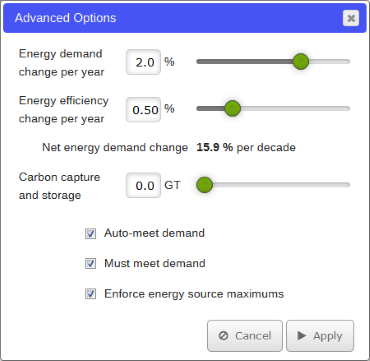
- Advanced Options
-
Opens a dialog box (see above) that allows you to alter the conservation
and carbon sequestration rates. This button is available on the Energy Efficiency lesson.
- This slider shows the growth rate of energy
demand per year. You can also type in a new value next to the slider.
- This slider shows energy conservation, which subtracts from
demand. You can also type in a new value next to the slider.
- This reports the per decade net annual growth in demand,
the result of the demand growth and efficiency per year provided above, compounded for ten years.
- This slider shows how much carbon is recaptured and stored
each year (see Unit 13, Chapter 4—CCS)
in gigatons (GT). You can also type in a new value next to the slider.
-
If checked, the simulator will attempt to meet demand by increasing each energy source by the
Net Energy Demand Change at the beginning of each decade. Because of the yellow-knob increase limits, this
often won't complete the job of supplying energy for the next decade, and you need to do further work by hand
in the Add Energy dialog box.
- If checked, you must adjust your energy sources so that the demand
is met each year before the Run Decade button is available.
- If checked, you cannot exceed the yellow-knob
warning limits in the Add Energy dialog box.
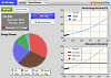
Graphs
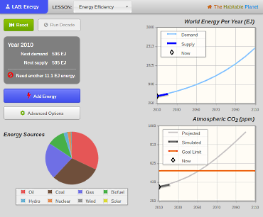
Energy Sources Pie Plot
This plot shows energy sources as a percentage of total energy production for the current decade.
You can mouse over or tap a pie slice for a tooltip reporting its value. Minor energy sources may not appear on
the pie, but all percentages are reported in the Add Energy dialog.
World Energy Per Yr (EJ) Graph
This graph shows energy supply and demand in exajoules over the course of the simulation. You can mouse over or tap
decade points on the line for a tooltip reporting the value at each point. Lines can be turned on and off by clicking
them in the legend box in the upper left of graph.
Atmospheric CO2 (ppm) Graph
This graph shows atmospheric carbon dioxide in parts per million (ppm). It is a reprise of the graph (and model)
used in the Carbon Lab. The graph can be manipulated the same way as the World Energy graph.