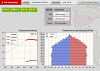
Lessons > The Demographic Transition > Step 2The overall population growth rate is only one of the differences among countries in different stages of the transition. The age-based population structure is also greatly affected. Look at the shape of population pyramid for all of the countries in turn. (The Population by Age Group graph is a standard representation of population structure, called a population pyramid.) Compare the pyramid shape of the countries that you found to be late in the transition to those that are earlier in the transition. Predict what you expect the shape of each pyramid to be in 2050. Then simulate it, and note the actual resulting pyramid shape. For example, the United States has a house-shaped “pyramid”. Nigeria has a young-heavy wide base. Indonesia looks like an onion dome in 2015. Decreasing populations progress into an “inverted pyramid”, where the top is wider than the base.
|