Tools of the Simulator
Simulator Controls
- Reset Button
- Returns the simulator to year 2015. This does not reload the original parameter
values (vital rates). To do that, you can either select another country and then re-select
this country,
or use the Reset button on the Birth or Death rate dialogs.
- Pause Button
- Stops the progression of the simulator at the moment it is clicked. Works with the Run
button.
- Step
- Simulates the progression of population as determined by the parameters for 5 years.
- Run
- Simulates the progression of population
as determined by the parameters to year 2050. After 2050, runs in increments of 50 years.
Simulator Parameters
COUNTRYThis pull-down menu allows you to
choose a country from those included with the simulator.
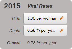
- Birth
- This button is labelled with the current
birth rate for the chosen country. Clicking on the button opens up a
Change Birth Rates dialog that allows you to alter the birth rate.
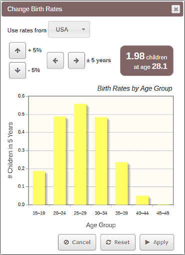
- On the Change Birth Rates dialog:
- Use the pull-down menu to choose any
country modeled in the simulator to copy birth rates from. Click "Apply" to make rate
changes active.
- Up/down arrow buttons allow you to change the
birth rates by increasing or decreasing by 5 percent
the average number of children born per age group per 5 years. The bar graph
below is updated to reflect the change.
- Right/left arrow buttons allow
you to change the average age of child-bearing women by shifting the bar graph rates right
or left by 5 years.
- The brown box to the right of the arrow buttons
shows the new average children per lifetime resulting from choices on this dialog,
and average mother age—a weighted
average of the number of children born at each age group and the probability of a
woman living to reach that age group and bear children.
-
Shows the average number of children born in 5 years to members of each
5 year age group.
- Reloads the original birth rates for the
current country.
- Death
-
This button is labelled with the current death rate per capita for the chosen country.
Clicking on the button opens up a Change Death Rates dialog that allows you to
alter the death rate.
- Note that birth rate per woman per lifetime, as labelled on the button,
stays constant from Step to Step, but the death rate changes each Step.
That's because the death rate per capita depends on both the age-specific
death rates, and the current shape of the population pyramid. For instance, when
more people are
over age 60, the overall death rate rises. Also if death rates
change, the birth rate per woman per lifetime changes, because more or fewer women may
live to a particular age to bear children.
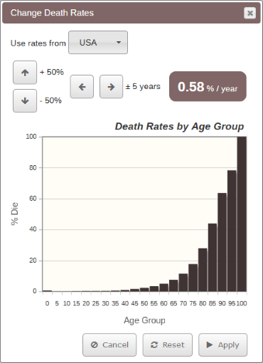
- On the Change Death Rates dialog:
- Use the pull-down menu to choose any
country modeled in the simulator to copy death rates from. Click "Apply" to make rate
changes active.
- Up/down arrow buttons allow you to change the
death rates by increasing or decreasing by 50 percent
the average number of deaths per 5 year age group over 5 years. The bar graph
below is updated to reflect the change.
- Right/left arrow buttons allow
you to change the death schedule by shifting the bar graph rates right
or left by 5 years.
- The brown box to the right of the arrow buttons
shows the per capita death rate per year resulting from choices on this dialog. This
is the same number used to label the Death button that opens the dialog.
-
Shows the percentage of people who die during their 5 years in each age group.
- Reloads the original death rates for the
current country.
- Growth
-
Reports the current population growth rate per year. This is updated after each Step.
A negative growth rate means the population is decreasing.
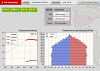
Population (millions) Line Graph
This graph shows a time series of population growth for the selected country.
The y-axis is the population (in millions) of that country for the year displayed
on the x-axis. You can mouse over or tap points on the lines for a tooltip giving
the line value at that point. The overall current population is also reported in the
top right corner of the plot. Clicking on a line in the legend turns it on or off.
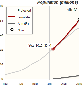
- On the graph:
-
Represents the population of the selected country
as projected by the
US Census International Database.
(See Unit 5 text, Section 3).
-
Although the IDB uses a similar model to this Demographics
simulator, the projected (grey) lines are often different than the simulated (red) lines.
This is because the IDB projection
incorporates migration and continuing shifts in birth and death rates. For example, in
the plot above, of Iraq, the IDB likely forecast decreasing birth rates and increased
emigration to account for 9 million in lower population than that simulated by
this Demographics simulator for year 2050. This discrepancy is most striking in the case
of Italy,
where the IDB Projected line expects the population of Italy to stabilize. But Italy's
current birth rates, death rates, and population structure dictate the population fall
sharply. In Italy's case, the IDB likely forecast massive immigration.
- Represents the population as simulated
with the current provided birth and death rates. No migration.
- Represents the population of the older
age groups.
- The diamond on the line highlights the current
year and simulated population.
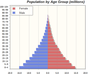
Population By Age Group (millions)
This graph shows the population (as number of people in millions), per age group
by gender. This is called a “population pyramid”. The blue bars represent the numbers of males and the pink bars represent
the numbers of females in each age group.
The overall population is the sum of all bars.
Early in the demographic transition,
the base of the pyramid is much wider than the top, as in this plot of Nigeria.
With a dwindling population, as with Italy and Japan, the pyramid shape may invert,
with the largest age groups toward the top.